Graphic Design
I am a Graphic Designer and Illustrator with a diverse portfolio of sophisticated, contemporary projects. I am always excited by the process of creating illustrations or shaping brand identities for new ventures.
Rorschach
Publication Concept
-
Concept piece for university graduation senior exhibition.
-
Conceptual coffee table book consisting of original botanical photography by Kelly Willis corresponding with academic text by John E. Exner.
-
Layout
Information Prioritization
Original Photography
Photographic Manipulation -
Black and white photography is inspired by the Rorschach psychoanalytical ink-blot tests.
Images of plants captured and manipulated to become layered with the text to create a woven appearance. -
Best Typography
Sam Houston State University Department of Art Senior Exhibition April, 2022
Merit Award - UCO School of Design, Salute 2022
A national student design competition
Graphic Design & Publication
RecSports
University Work Experience
-
RecSports Sam Houston State University Huntsville, Texas
-
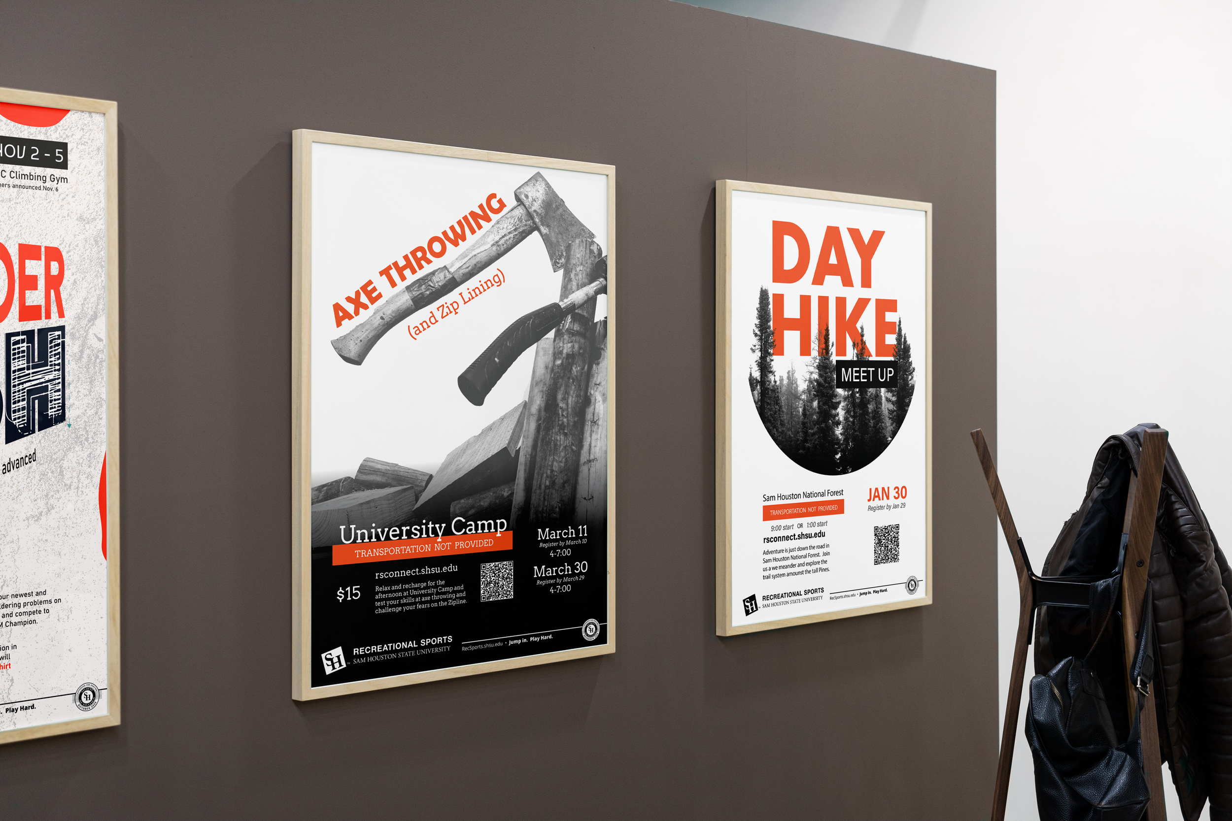
Student worker projects adhering to University brand guidelines with creative leeway for original illustrations.
Create original illustrations for the Outdoor's department give-a-ways and advertisements.
Selecting and manipulating photography captured by the marketing team's photographer to use for department event advertisements. -
Layout
Illustration
Posters & Flyers
Social Media layouts
Photographic Manipulation -
Hand-drawn illustration rough drafts then finalized digitally.
-
National NIRSA Creative Excellence
Marketing Graphic Designer of the Year 2021-2022
Recreational Sports, Sam Houston State University
Diversity
Museum Concept Series
-
Concept piece for university senior exhibition.
-
The Diversity of Cephalopods shows the variety of shapes, sizes, and colors across a select few of cuttlefish, squid, and octopi.
All illustrations were digitally drawn with my stylistic approach to academic representation. -
Layout
Information Prioritization
Original Photography
Photographic Manipulation -
After introducing the creatures' form with a monochromatic color scheme, the layering of their textures was next. Although these were digitally drawn, no special brushes were used; all illustrations were completed using one brush with several layers of color and meticulous addition of details.
Procreate
Photoshop -
Best Illustration
Sam Houston State University Department of Art Senior Exhibition April, 2022
Merit Award - UCO School of Design , Salute 2022
A national student design competition
Graphic Design & Illustration
MBI Ad Campaign
Social Media Series
-
Mosaic Breast Imaging
-
Responsible for graphic design layout and writing copy with the images provided to me. This series was posted throughout October to raise awareness.
-
Social Media
Layout
Copywriting
Iconography -
The production team provided the photography and I wrote copy for all posts in the series accordingly. I then designed the series with layout, typography selection, and the ribbon vector.
-
American Advertising Awards - Bronze, Knoxville 2025
Nutrition Handouts
Health Education Handout Series
-
Black Belt Health
-
A series of education handouts to teach their clients about healthy food categories with tips and recipes.
-
Information organization
Photography selection
Layout -
Adhering to brand guidelines and provided text, I organized the text to create the series set of handouts that were print and digitally ready for their customers.
I was given creative freedom to select from stock photography to find the best pairings for the text.
InDesign
Photoshop
KINDLERFIRE
Volunteer Brand Identity
-
Kindlerfire (R) LLC.
-
A veteran-owned company selling this unique tool for fire starting in a survival or bushcraft setting.
-
Packaging
UI & Web Design
Layout
Brand Development -
The name is a pairing of two words; Kindler and Fire. Kindler s the wooden shavings the tool creates and fire is the ultimate goal. This dictated the color scheme and gradient used it the logo. The gradient was intentionally stopped at "Fire" to help separate the two parts of the name.
InDesign
Photoshop
Illustrator
Wix.com
TexStar Chiropractic
Introduction Handouts & Locations
-
TexStar Chiropractic
-
Chiropractic company in Austin, Texas. Dr. Bios introduce their lead doctors and owner with listed specialties and notes. Their offices include the slideshow presentation for the waiting rooms, and hand-lettered illustrated stickers as a take-away.
-
Layout
Information Prioritization
Presentation / Slideshow
Illustration -
Following the brand guidelines, I was given text to organize and prioritize for all projects shown. I utilized the versatility of the logo mark to create curves in the text layout, motion graphic for the presentation background, and balanced sticker shape.
-
InDesign
Keynote
Illustrator
Photohop
Procreate
Figma
Joy of Chickens
Book Redesign Concept
-
Concept piece for university senior exhibition.
-
Conceptual redesign reference book consisting of original illustrations by Kelly Willis and corresponding with academic text by Jennifer Megyesi.
-
Layout
Information Prioritization
Illustration
InDesign
Procreate
Photoshop -
Selected text by Jennifer Megyesi's The Joy of Keeping Chickens and created original illustrations to correspond.
Procreate
InDesign
Photoshop
Nova Path
Risk Management Logo
-
Nova Path Risk Management Re-brand design pitch.
-
The company wanted to rename their business with a new brand. Given full creative freedom, I developed this brand to pitch as bold, modern approach.
-
Brand Development
Typography
Presentation -
The mark represents a path as a conceptual “N” to visually complement the word “Nova”. The asymmetry of this mark symbolizes resilience and balance. This shape’s versatility allows for additional applications such as layering, patterns, and secondary accents.
-
Figma
Photoshop
Rudi Lechner’s
Menu Redesign Concept
-
Concept piece for university senior exhibition.
-
Conceptual menu and logo redesign for a German restaurant in Houston.
-
Layout
Information Prioritization
Original Photography
Photographic Manipulation -
The coasters have interactivity to show if the customers are requesting another drink (blue side).
The menu utilizes simple German words that can be understood by context.


